Before the class started, we had an ice-breaking session to lose the tension,
and Dr. Charles, my Design Principle module lecturer gave us a brief
introduction about Design Principle in order for us to have a better
understanding of our task throughout the whole semester before diving deep
into the module.
Topic 1.1 ELEMENTS OF DESIGN AND PRINCIPLES OF DESIGN
ELEMENTS OF DESIGN
Figure 1: 7 elements of design
The elements of visual design include line,
shape, form, space, texture, value, colour.
POINT a point used as a repetitive mark forms a line.
LINE simply a mark that is connecting any two points.
SHAPE is a self-contained
defined area, either geometric or organic. Shape refers to a two-
dimensional element with the area on a plane
FORM refers to a
three-dimensional element with volume in space.
SPACE is the indefinable, general
receptacle of all things.
TEXTURE is the surface quality of a shape, or how it
appears to feel: rough, smooth, spiky, soft, hard, and glossy, etc.
Texture can be real or implied.
COLOUR / VALUE is the
visible spectrum of radiation reflected from an object. refers to how
light or dark an object, area, or element is, independent of its color.
Value is also sometimes referred to as tone.
PRINCIPLES OF DESIGN
Figure 2: Principles of design
Contrast
Figure 3: Principles of Design: Contrast
Contrast creates space and difference between elements in your design.
The background needs to be significantly different from the
color of your elements. The difference in objects could be light and dark, thin and
thick, small and large, bright and dull, etc so they work harmoniously together and are readable.
Figure 4: Principles of Design:
Proportion/Scale
Proportion refers to the relationship between one
part of a design and another part or to
the whole design. It is a comparison of
sizes, shapes, and quantities. For
example, the relationship between the
vertical and horizontal measurements of a
wall hanging may be pleasing because the
unequal lengths produce an interesting
contrast.
Figure 5: Principles of Design: Hierarchy
Hierarchy is the principle of arranging elements to show their
order of importance.
TOPIC 1.2 GESTALT THEORY
Figure 6: Gestalt Theory
Gestalt theory emphasizes that the whole of anything is greater than its parts.
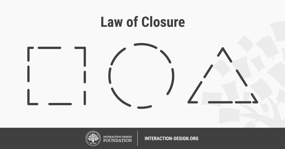
Closure
Figure 7: Gestalt Theory: Closure
The eye prefers to see the image as a whole. The illusion of seeing an
incomplete stimulus as though it were whole. Thus, one unconsciously tends
to complete (close) a triangle or a square that has a gap in one of its
sides.
Proximity
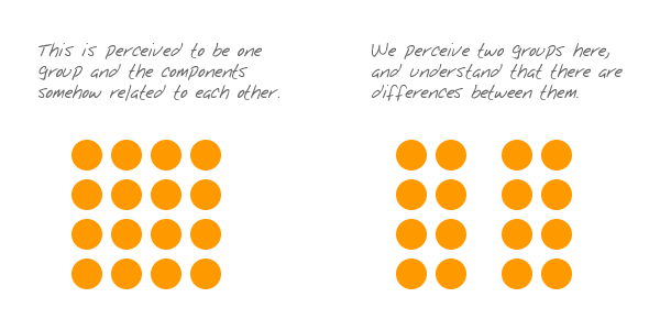
Figure 8: Gestalt Theory: Proximity
Proximity refers to things that are close together appearing
to be more related than things that are spaced farther apart. Placement of objects or items such as near or close-edged, touch,
overlap or layering and combine can be perceived as a
group.
Similarity
Figure 9: Gestalt Theory: Similarity
The gestalt principle of similarity says that elements that
are similar are perceived to be more related than elements that are
dissimilar. Similarity helps us organize objects by their
relatedness to other objects within a group and can be affected by
the attributes of color, size, shape, and orientation.
Similar objects are more likely to form groups.
Continuity and Alignment
Figure 10: Gestalt Theory: Continuity
The principle of continuity states that elements that are arranged on a line or curve are perceived to
be more related than elements not on the line or curve.
TOPIC 2 BALANCE AND EMPHASIS
Balance
Figure 11: Principles of Design: Balance
Balance refers to the way visual elements are arranged so that
their visual weight harmonizes with the other elements in the design,
and the composition gives an appearance of properly distributed
elements. There are 2 main types of balance: symmetrical and asymmetrical
balance.
Symmetrical balance is the simplest to create and involves placing objects of the
same weight. Each object on one side, corresponds to a similarly weighted object,
on the other side.
Asymmetrical balance uses opposite weights (like contrasting one large element with
several smaller elements) to create a composition that is not even but
still has equilibrium.
Emphasis
Figure 12: Principles of Design:
Emphasis
Emphasis creates a
focal point in design composition, it is how we bring attention to
what is important to it but doesn’t overpower the rest of the design (or it would be out of
balance).
TOPIC 3 REPETITION AND MOVEMENT
REPETITION
Figure 13: Principles of Design: Repetition
Repetition is the reusing of the same or similar elements throughout the
design. We use repetition to create a sense of unity and consistency
throughout a design. Repetition creates a particular style,
creates cohesiveness, creates emphasis, hierarchy structure and
strengthens a design.
Movement
Figure 14: Principles of Design: Movement
Movement is the path that a viewer's eye takes to the piece of art, often leading
to the focal areas. Such movement can be directed along lines, edges, shapes, and colors
within the piece of the design.
Topic 4: Harmony and Unity
Figure 15: Principles of Design: Unity/Variety
Unity is an agreement between parts that make up the
whole. Unity is the principle of design that unifies all other principles
within a piece of work, allowing each individual element to coexist
with one another to form an aesthetically pleasing design.
Figure 16: Principles of Design: Harmony
Harmony is the principle of art that creates cohesiveness by
stressing the similarities of separate but related
parts. Harmonious elements have a logical relationship, connection,
alignment, or progression. They work together and complement each
other.
Topic 5: Symbol, Word and Image
Symbol
Figure 17: Principles of Design: Symbol
In the design world, a symbol is a combination of graphic elements that can be used to represent a
brand's identity, communicating its story and influencing the way it is perceived
by consumers. There are 3 different types of symbols: pictorial
symbol, abstract symbol and arbitrary symbol.
Pictorial symbol
Figure 18: Pictorial Symbol
It is a graphic symbol that conveys its meaning through its
pictorial resemblance to a physical object.
Abstract symbol
Figure 19: Abstract Symbol
A symbol that (a) has a form that does not suggest its meaning,
(b) has a meaning and use that have not been defined by general
agreement, and (c) must be defined for each specific set of
applications.
Arbitrary symbol
Figure 20: Arbitrary Symbol
a linguistic sign, for example, a verbally spoken word, that
bears no obvious resemblance to the thing or concept
signified. a sign that seems to be logically unrelated to the object is it
supposed to represent.
Word and Image
Figure 21: Principles of Design: Word and Image
In design, word and image are used to convey messages or concepts,
regardless of what form. Using suitable images and word in a work of
design is important as it helps users to understand more of the
product or item. Both word and image work harmoniously together to
bring out the perfect effect or image to users.
TASK 1 : EXERCISE 1 ( 04.04.2022 )
At the end of week 1, Dr Charles ended it by giving us an exercise on
creating our own monogram based on Gestalt Theory's Figure-Ground.
OUTCOME:
Dr Charles commented on my first V saying " it is straight forward
and the V seemed to be the figure against the background. For the
second one, it was good and show ambiguity, which is less obvious but
more effective." very interesting". For the third try, Dr Charles said
that I could work another way round to emphasise the V. Hence I did a
fourth try, in which I drew only half a V giving a figure-ground
effect, making the background is more important than the
V.
FOURTH TRY:
Reflection
To be honest, I have never known that there were principles that
existed in the design world. All i thought was just you draw whatever
comes in the mind. I never knew that there was Movement, Gestalt
Theory, Hierarchy, and many more. In the design world, it is actually
complicated but fascinating at the same time. Whenever I come across a
design work, my only reaction is just pure gasping and wondering when
will the day come when I reach that level. There is a lot more for me
to explore in the future, and I wish to learn more to produce amazing
artwork! At the end of this week, I have learnt a lot and I feel that
I am a little closer to being a small designer!!!
___________________________________________________________________________________
REFERENCE
Figure 10: from lecture video
Figure 20: From lecture video


Comments
Post a Comment